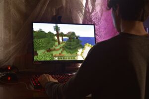
Minecraft was created in 2009 by Markus Persson, known as Notch. At first it was just a small project, developed in his spare time, without a big budget or a huge team behind it. However, the idea was so original that the game caught on very quickly. An open world, made up of simple blocks, where the player can build anything they imagine.
Being a pixelated game based on square shapes, it was only natural that the logo would follow the same idea. So from the beginning, the Minecraft logo was drawn with big, thick, square letters, just like the blocks in the game.
The first versions of the logo
In its early years, the Minecraft logo didn't look quite like the one we know today. It underwent several small changes, but a few things remained constant:
- The square font, inspired by the pixels in the game.
- 3D text, to give the impression that it is "built" from blocks.
- Gray or dark gray color, reminiscent of stone or metal.
The first versions of the logo were simpler, less elaborate. As the game became more popular, the logo was refined, adding shadows, textures, and small details that made it look more realistic and "heavy", exactly as it should be in a world built of stone and solid materials.
Changes made by Mojang
After Minecraft became a global phenomenon, the Mojang team (the company founded to develop the game) started working more seriously on the brand image. So the logo also received a more professional treatment.
Around 2011-2012, the logo was updated to show:
- The letters have cracks and chips, as if they were carved into stone.
- More complex textures, which give the impression that each letter is made from a block of stone.
- A little "Creeper" face hidden in the letter "A", as a fun little detail for fans.
This variant became extremely beloved by the community and remained virtually unchanged for many years.
What does the Minecraft logo mean?
The Minecraft logo isn't just cool text written in pixelated style. It perfectly reflects the world of the game:
- Square blocks are the essence of the game and also appear in the logo.
- The idea of building and "sculpting" the world around you is suggested by the chipped and cracked letters.
- The stone texture conveys the idea of solidity, stability, but also adventure.
- The hidden Creeper face reminds us that Minecraft is not just about building, but also about survival and danger.
In a very simple way, the logo manages to tell a complete story about what Minecraft is, without the need for further explanation.
Adaptations over time
As Minecraft was released on multiple platforms – PC, consoles, phones – the logo was slightly adapted for each:
- Minecraft: Pocket Edition – a more compact version, with smaller and thinner text.
- Minecraft Dungeons – a version with a more adventurous and dark style, suitable for the action game.
- Minecraft Earth – a more colorful and friendly interpretation, adapted for augmented reality.
Even though each version has slight differences, they all keep the same base: thick, square letters, stone texture.
Minecraft logo after acquisition by Microsoft
In 2014, Microsoft bought Mojang, and thus Minecraft, for a whopping $2.5 billion. Many fans feared that Minecraft would become “too commercial” and that its image would be radically changed.
Fortunately, Microsoft understood how important the logo was and kept it almost unchanged. The only minor adjustments were:
- Slight improvements to textures.
- Color adjustments for better visibility on all screens.
- Graphical optimizations for mobile and console versions.
Thus, the Minecraft logo has managed to stay true to its roots, even under a new owner.
Why is this logo so loved?
The Minecraft logo is successful for several reasons:
- It's simple. – can be easily drawn even by a child.
- It is memorable. – once you've seen it, you don't forget it.
- It represents the game perfectly. – built from blocks, adventure, creativity.
- It is friendly. – it is not threatening or too serious, but inspires play and imagination.
Moreover, the logo has become a part of pop culture. You see it on T-shirts, backpacks, toys, computer accessories, and even birthday cakes.
Curiosities about the Minecraft logo
To make the article even more interesting, here are some lesser-known facts:
- There are dozens of small versions of the logo used in special events, such as game anniversaries or major updates.
- In some limited editions, the Creeper face on the letter "A" was temporarily replaced with other characters (for example, during the holidays).
- The logo was also used as inspiration for the creation of the official Minecraft fonts, used in menus and promotional materials.
Conclusion
The Minecraft logo is not just a simple drawing or a word written in square letters. It is an important piece of the game's identity, a symbol of creativity and freedom. From the early days when Minecraft was just a small and unknown project, to the moment it became a worldwide phenomenon, the logo has always been there, evolving with the game, but without losing its essence.
It's proof that sometimes, the simplest ideas are the ones that manage to stay in people's hearts for a very long time.

