
McDonald's is today one of the most well-known brands in the world, but its beginnings were simple. It all started in the 1940s in the United States, with brothers Richard and Maurice McDonald, who ran a small drive-in restaurant.
Their concept of speed of service and limited menus was revolutionary for the time. But it wasn't until Ray Kroc, a blender salesman, joined the business in the 1950s that McDonald's began to become what we know today: a fast-food empire.
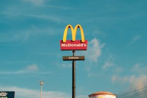
During that period of rapid growth, the company needed a clear and memorable image to differentiate itself. Thus began the story of the McDonald's logo, now known as The Golden Arches.
Early forms of the McDonald's logo
At first, McDonald's didn't have a logo of its own. Their advertisements and menus only featured the restaurant's name, without a strong visual symbol.
In the 1950s, when one of the first modern McDonald's restaurants was being built, architect Stanley Meston had the idea to add two golden arches to the building's structure. These large, curved arches quickly became a distinctive feature and, without realizing it, laid the foundation for the future logo.
In 1961, Ray Kroc and his marketing team realized the power of these arches and decided to turn them into the official logo. The design brought together the two arches in a shape that vaguely resembled the letter "M", the initial of the McDonald's name.
What do the Golden Arches mean?
The Golden Arches are much more than just two curved shapes today. They have come to symbolize:
- Accessibility and familiarity: wherever you see the Golden Arches, you know exactly what to expect.
- Speed and convenience: a place where you can stop for a quick meal, whether you're at home or in another corner of the world.
- Joy and childhood: For many people, the first memory of McDonald's is related to a meal with family, a Happy Meal toy, or a small celebration.
The yellow color used in the logo was not chosen by chance. Yellow is associated with sunshine, warmth, and optimism, feelings that fit perfectly with the idea of friendly and accessible fast food. Combined with the red background (a color often present in promotional materials and restaurants), the logo immediately attracts attention and stimulates the appetite.
How the McDonald's logo evolved
Although the Golden Arches have always remained at the center of the logo, the design has changed slightly over the decades:
- In the 1960s and 1970s, the logo included the full name "McDonald's" above or near the arches.
- In the 1980s, the design became cleaner, with increasing emphasis on the letter "M" formed by arches.
- In the 2000s, McDonald's began using the simple version of the logo: just the golden arches, without text.
This move toward simplicity was a smart one. Today, the Golden Arches are so recognizable that McDonald's no longer needs to write its name below the logo. When you see the yellow "M," you instantly know who it is, regardless of language or culture.
McDonald's and modern logo adaptations
In recent years, McDonald's has demonstrated that it knows how to be modern and flexible, adapting its logo to various campaigns and special events.
For example:
- On International Women's Day, in some places, the McDonald's logo was reversed to form a "W" instead of an "M," as a sign of respect for women.
- During the pandemic, versions of the logo with the arcs separated were created to promote the idea of social distancing.
These adaptations show that although the logo is extremely strong and recognizable, it can also be flexible without losing its identity.
Why the McDonald's logo is so effective
The McDonald's logo is considered one of the best in the world, for a few very simple reasons:
- It is extremely simple, but very memorable.
- Use colors that attract attention and evoke positive emotions.
- It can be recognized from a distance or at small sizes.
- It has an authentic story behind it, linked to the company's roots.
Additionally, by constantly associating the logo with a positive experience (fast food, joy, family moments), McDonald's has managed to transform the Golden Arches into an almost universal symbol of comfort.
Interesting facts about the McDonald's logo
- It is estimated that over 90% of the world's population recognizes the McDonald's logo.
- The initial design of the arches was inspired by the actual architecture of the buildings, not originally intended as a graphic logo.
- The yellow color is also chosen because it is very visible from a distance, especially in low light conditions or while traveling by car.
Conclusion
The McDonald's logo is a perfect example of how a simple yet powerful design can become a global symbol. With just two golden arches, McDonald's has managed to create an unmistakable visual identity that transcends languages, borders, or generations.
Today, the Golden Arches don't just mean fast food. They mean an experience, a memory, a moment of joy in the lives of each of us.