

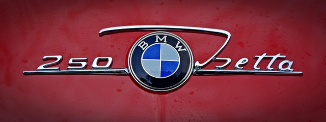
We all know what the unique BMW logo looks like.
This is one of the most recognizable symbols in the automotive industry, with a rich history and special significance. Over the years, the same car logo has remained true to its roots, but has subtly evolved to reflect the values and identity of the brand.
In this article, we will explore the origins, meaning, and evolution of BMW logo.
The Origin of the BMW Logo
BMW (Bayerische Motoren Werke) was founded in 1916 as a manufacturer of aircraft engines. The first iconic BMW logo has its roots in this period, being largely inspired by the company's work in the aeronautics field.
One of the most widespread theories about the origin of BMW logo is that it represents a moving airplane propeller, with the colors white and blue, which suggest the sky. This interpretation comes mainly from a 1929 advertisement, in which the official logo was presented against the background of a rotating propeller. However, official documents indicate that the logo was not originally created to symbolize a propeller, but to reflect the company's Bavarian identity.
.svg)
The meaning of the BMW LOGO
The BMW logo consists of a black circle with four alternating blue and white sectors. These colors are inspired by the flag of Bavaria, the company's home region. In this way, BMW wanted to emphasize its strong connection to Germany and its industrial heritage.
The black circle surrounding the central elements of the logo was taken from the logo of Rapp Motorenwerke, a company that preceded BMW and specialized in the production of aircraft engines. Therefore, the current BMW logo reflects both its Bavarian heritage and its roots in the aviation industry.
The evolution of the BMW logo
Since the company's founding in 1916, the first logo creation process has undergone several changes.
Here is a video:
But its basic structure has remained unchanged. Here are the main stages of its evolution:
- 1917 – The first BMW logo is officially introduced. It already featured the black circle with the letters BMW and the four blue-and-white dials.
- 1933 – A more obvious outline of the letters is added and the clarity of the graphic elements is improved.
- 1953 – The colors become more vibrant and the logo takes on a more modern look.
- 1963 – Smoother lines and a more sophisticated design are introduced, adapted to the era.
- 1997 – The logo receives a three-dimensional effect, giving it a more premium and high-tech look.
- 2020 – A minimalist design is introduced, with a simpler and more transparent approach, adapted to the digital age.
What does the same BMW Logo look like today?
Starting in 2020, BMW adopted a new logo with a flat design, eliminating 3D effects and a solid black background. It reflects the modern trend of brands adopting a minimalist and digital-friendly style. The current logo symbolizes the company's transparency, openness and technological progress.
Although the logo has evolved over the years, its essence has remained the same: a symbol of German quality, performance and innovation. BMW continues to be a leader in the automotive industry, and the iconic representation is instantly recognizable around the world.
Conclusion
The BMW logo is not just a simple graphic symbol, but an element that embodies the company's tradition, innovation and Bavarian identity. From its origins as a manufacturer of aircraft engines to its leadership position in the automotive industry, BMW has maintained a logo that reflects its core values.
The subtle evolution demonstrates the brand's ability to adapt to the times while maintaining its strong heritage.